Thursday, December 31, 2009

Preparing for a Second Day on It

An unexpected day of quiet in the holiday season.  Two in fact.  To the easel.

It has been difficult to forget the large painting on my easel.  Christmas Eve, Day, and the Day after with a room full of guests could not detract the critic from looking over everyone's shoulder at the start of a snow scene taken from the small done on site.  The agony of being unable to attend to errors, omissions, large canvas alterations etc.  So now that I have some time, I already have a list and a sense of direction to pursue.

Coffee up, put on the play list, and get in there to squeeze out.  Scrape off the dried up pigment.  Lets see, squeeze out Cobalt Blue, Cadmium Yellow Middle, Alizarin, Veridian, and Titanium White.


Restarting "At the Edge of It", 36x48, Oil on Canvas

There are more piles of paint than those you say.  True.  The paint mentioned is the foundation for the painting and are squeezed into large masses - for example the Titanium worm is 8 or 9 inches long and an inch wide (palette is 14x36 inches with glass over a warm backdrop to aid in seeing the colours).  The other paints were put out in smaller piles since they were not used much in the preliminary round for this painting.  Here I put out Mineral Violet, Ultramarine Blue, Cadmium Yellow Lemon, Cadmium Yellow Deep, Cadmium Orange, and Cadmium Red Middle.  I try to put out enough pigment so that I will not starve the palette in a 5 hour session.  (Failed with both the white and the cobalt).  The worm shape is convenient for keeping a clean pile available for mixing.  The pattern on the palette comes from the Practical Colour Wheel.   Light yellow in the middle, warm colours to the left, and cool to the right - in the same sequence as the wheel but straightened out along the top of the palette.

You will see that I built this easel (less than $20).  It works fine from 6x8 to 42x60 and larger.  Since I stand to paint the majority of time I don't miss crank and pulley adjustment of canvas height.  To the left you can see a bit of my French easel.  It is now holding my reference painting.  It has its palette directly below the painting and between you and the easel.  I like this location for the palette.  It keeps you away from the painting surface thus promoting the use of the long handled brush and forcing me to stay away from trying to render detail or going to the end of the painting before doing the beginning and middle.  The middle value palette helps with seeing colours when mixing and the close proximity to the painting also assists in this regard.  One flaw is the space accorded the coffee cup.  It seems to have an affinity to Cadmium.  As Vincent found, this is not a good thing for the artist.  On the make it yourself theme, notice the use of Salmon tins for thinner and medium.  Paper towels are to the left, and my tabouret is to the right.  The overhead light is coming from the open kitchen and the outside light is North.  There are a number of push pins along the palette.  I am not sure what I have used these for.  Also on the palette is a container of brush cleaner and a container of gum arabic.  Both are used for brush restoration so should be somewhere else.  Also to the right is a ceramic brush holder I made in a pottery class years ago.

The painting did make some good progress today.  #12 and larger brushes and thicker paint.  Not enough light for a photo.  I'll finish off next year.

Saturday is a paint out at Scotsdale farm.

Tuesday, December 29, 2009

Earth Tones and the Practical Colour Wheel

Per the original post on the Practical Colour Wheel, purpose number four has to do with mixing earth tones.  All the pigments listed on this colour wheel are high chroma colours.  Since earth tones are grayed versions of the primaries, they are not shown.  If they were shown, they would be inside the colour wheel - towards the centre.  For example, yellow ochre is a yellow (primarily) and would be shown on the wheel between yellow and the centre of the wheel.  It may be mixed from the primary colours.  How?  Since it is in the yellow family, start with a primary yellow (cadmium Yellow), the add in small amounts of primary red and primary blue.  Then add white to get the value desired.  This version of yellow ochre will be rich but grayed (compared to Cadmium Yellow).   Experiment with it - mixing is an excellent exercise.  To get Burnt Umber (a clean version of it) mix the same three pigments but with a dominant Orange (Yellow and Red) with the Blue.  Although this requires mixing it does not "dirty" other mixtures like Burnt Umber from the tube.


Yellow Ochre mixed from Primaries


Any two colours on the Practical colour wheel will gray when mixed.  For example, Untramarine Blue plus Cerulean Blue will approximate Cobalt blue - slightly grayed.  To the extreme, two colours opposite on the wheel (complements) will go totally gray in the correct proportions - like Alizarine and Viridian.  The more pigments mixed, the more gray or mud.  The addition of white also grays pigments (and cools them).


So, what is the significance of all of this information?


1.)  It allows one to use a simple palette such as three primaries to make good paintings.  This reduces the decision making process and helps with speed.  A virtue en plein air.  But it requires mixing - a great place to start a painting career.


2.)  It helps one understand how mixing works, colours and values.


3.)  It helps one design a palette for making high key colour paintings - not much gray here.  A requirement for non tonal painting.


4.) It helps one to "see" from the study of life subjects.


5.)  It helps one in the pursuit of abstract painting - still need to know how colour works and how to get an effect.

Monday, December 21, 2009

In the Studio from a Small

It has been 10 straight days in the studio.  Need to get out for a few hours to sharpen up.  Maybe Wednesday.


In the studio I paint several ways.  Sometimes from imagination, sometimes from life, on occasion from a photo, often from a sketch.  Here I am working from a small done on site.  In this case the small is a 6x8 and it is only going up to an 11x14.  Here is the set up.


Dark and Deep in process

When you paint larger, more information is required.  Here the rub is that I have only the 6x8.  So I have to try to remember what I was trying to do.  It helps that I have been on site for the small and that I have done this before.  I did a pencil sketch with notes for the small, and I have a photo.  However, I liked the small and decided not to bother with the other reference.  I decided to develop more depth.  After this photo was taken I realized that I still had considerable painting to do.  You will notice considerable paint on the palette.  I don't like to stop to squeeze out - breaks the zone.  I leave the fresh paint on the palette after the day of painting and clean up the mixing pools.  For the next day I add more fresh paint to the existing.  You can see the paint on the palette from left to right - Alizarin, Cadmium Red Middle, Cadmium Red Light, Cadmium Yellow Deep, Cadmium Yellow Middle, Cadmium Yellow Lemon, Viridian, Cerulean Blue, Ultramarine Blue, Mineral Violet, and Titanium White.  To this point I used only a #14 bristle filbert brush.  I may move to # 6 and #8 as the painting progresses.  So far the painting reflects only the correction of the main colour masses in the mid values.  The lightest and darkest values have been saved for hi-lites and accents.  In this case these are quite colourful.

Sunday, December 13, 2009

Back to the Original Two

Saturday was a beautiful day.  Blazing sun after an interesting sun rise - muted oranges in the south east, and Grey Blue down to fantastic pinks, and finally Prussian Blue at the horizon.  At the first stop in North Hockly it was -11C with a nasty wind.  Wrong easel for the wind.  Vic in his wisdom brought a French Easel.  No problem.  Well dressed and still a future reserve for expected cold days.  Excited and smug in the comfort and beauty.


Interesting high key image facing north.  Quick set up and sketch.  A warm key in the winter.  Set the clock for 10 minutes after the setup.  Just enough time to do a quick wash.


Just a Field by the Road, North Hockley

Looking at the setup from the car gave me the first hint of things to come.  You would think I had never done this before in the happy season.  At least I did have an oil change to Graham paint.


Set the easel up out of direct sun

Look at the glare on the easel.  Makes it hard to see the colours and the values.  Pupils shut down.  Later I was able to see the violets where I assumed the snow was in full sunlight.  It was, but the sky was reflecting on the snow.  Evidence?  Just look at the hi lites where the snow has a reflecting bank from ploughing - brilliant and colour and value contrast compared to the fields.


As a correction, I put myself in front of the sun creating a cast shadow on the white board.  A bit of eye relief.  Then in my excitement I proceeded to block in the masses on top of my wash.  Things went of the rail at this point.  The snow was a yellow in a high value - wrong!  The block in was very heavy, not good for layering.  The blues and violets that attracted me to the image were changing rapidly but I blocked them in last - should have been first - different colour and disappearing now.  Try to remember what was there and paint that.  The timer interrupts.  In the car we discuss our pin hole eyes and what colour is on the snow exposed to the sun.  We agree that it is a variety of violets.  Back to the easel.  Try to layer some violets on top of the thick paint representing yellow snow.  What a gooey mess.  the the tree line, weeds, and sky need correcting.  More paint.  Seems that with cold fingers I can't control the brush not to mention the viscosity.  Then there is the grey mass.  Was it frozen?  Another car break.  We consider trading paintings at this stage.  Then I think palette knife.  Back out into it.  This thing needs to be scraped off.  Much better.  But the sun is overhead and all has changed.  We decide to hide out for lunch.

For the afternoon session we calm down and decide to do a three timer session painting before calling it quits for the day.  That went much better.  Relax, squint, see the masses, paint from the shoulder, control the viscosity. block in the masses, adjust.


Later in Hockley, 8x10, Oil on Canvas

Wednesday, December 9, 2009

Adjusting the Dominance

Today we have the first significant snow of the season.  Huge wet flakes drifting in.  Mesmerizing.  A great way to start off the studio this morning.  Looks like Saturday before getting outside again.  By then I'll need to sharpen up again.  If it keeps cooling off I'll have to make an oil change for the outdoor box.


The scene is a late afternoon at Silver Creek.  The sun is blazing.  Warm but cooling quickly.  I am facing north.  The west side of the stream and bank is in shadow.  I am on the road, not good.  Don't hit me.


It came back to me pretty well in the studio.  The on site work was weak in drawing and the shadow side vs the sun side had to be adjusted for value.  Parts of the shadow were too warm and bright.  Parts of the sun side were not hot enough or bright enough - according to my memory and my brief sketch notes.  I wanted the shadow side and temperature to dominate, so I made sure that at least 60% of the picture plane was in shadow.  On the sun lit side coming to light was achieved by going up the practical colour wheel and adding a bit of white (remember that white cools and greys colours).  Since we are only working with pigment we can get light if first we have dark.


Afternoon Delight, 10x12, Oil on Canvas on Board

The concept of the painting was to show the prevailing colour key without seeing the sky.


The painting was done with a #14, a #8, and a #6 hogs bristle Filbert and lots of paint.  The palette was Ceruleum Blue, Cadmium Yellow, Cadmium Yellow Deep, Alizarin, and Titanium White.

Monday, November 30, 2009

What You See Depends

This is item 3 from the list around The Practical Colour Wheel.


Josef Albers (1888 - 1976 studied colour all his life.  In particular, he studied the effect of colours placed adjacent to one another.  They affect each other's value, saturation, and hue.  This is the visual effect of simultaneous contrast.  Mark Rothko's colour field paintings were based on this phenomenon.


Here is an example from the practical colour wheel pigments.  The pigments are (near) compliments (Ultramarine Blue and Cadmium Orange).  The two complements were mixed to form a grey.  One of the complements was taken pure with a dab of white added, and placed in the middle of the grey.


"A Little Bit Lighter and a Hell of a Lot Brighter"

David Leffel would say colour against colourlessness.


And here are a few other samples of one colour affecting another.


Value, Tone, and Intensity


This has numerous implications to the artist.


Because of the field influence a pigment taken from the palette will "change colour" when applied to the canvas.  For example, if you mix on a toned palette and place paint on a white canvas, the initial strokes will appear darker.  As you continue to block in the painting will tend towards mid tone and the colours and values will remain more the same.  The opposite is true for a white palette.


Years ago I noticed a dramatic colour shift in a brush loaded with yellow ochre.  Before my eyes it turned green as I applied it to my canvas.  At the time the canvas was blocked in and the dominant colour mass was a transparent yellow.  Of course when you understand the make up of a non primary colour the outcome is a little easier to predict.  Otherwise, declare a mixing day or session on a regular basis.


Experiment with this concept.  The outcomes are endless.

Thursday, November 26, 2009

Always, Never, Sometimes

Artists often ask if every plein air painting is completed in the field.  No, and quite a number have little or no merit and become "skimmers", not keepers.  The training is always good.


Last time out we all got to do 3 paintings.  This is my third for the day.  Late day sun was beautiful.  However, my palette, which looked loaded with paint after I squeezed out, was starved by the time I got into this painting.  Short on white, and yellow, no viridian to speak of, lots of Alizarin and Ultramarine and sufficient Mineral Violet.  Not enough time to squeeze out reinforcements.  Sun going to the horizon quickly.  So, quick thumbnail for value and composition.  Then 15 minutes of frantic painting and searching for paint.


Third Key of the Day, 10x12, Oil on Board

Lots of work to do.  You can see the board showing through.  The colours are off, values need to be resolved.  Light source to be resolved.  Some focal painting to be done.  Then again, is it worth while?


Painted with a dirty #8 bristle filbert.  Comments welcome.

Tuesday, November 24, 2009

Values and the Practical Colour Wheel

The Second purpose of the colour wheel arranged this way is to provide a value vs. colour guide.  Looking at the PCW (Practical Colour Wheel) you will find a grey scale on the left hand side.  This value scale ranges from black on the bottom to white at the top.  The pigments on the wheel correspond roughly to this value scale (If you wish more detail on this, write to me).  For example, Cadmium Lemon Yellow is about a 9 on the value scale.  Its near complement Dioxy Violet is about a 1.  Most of the pigments are in middle values.


Practical Colour Wheel vs Value

This might seem trivial.  However, when teaching I find that many people struggle with value once colour is introduced.  The result is a painting with middle values.  Such a painting is read as dark, lifeless, or perhaps reflective of a rainy day when indeed it is a bright sunny day.  I see countless paintings in juried shows exhibiting the same look.


A reference to the wheel would tell a painter that a sky painted with a mixture primarily of Ultramarine Blue (value ~2) would have to be lightened significantly to bring it to a 9 if that is what you see.


In addition, there are value checkers available commercially.


This configuration can also lead you to mixtures for a beautiful dark instead of using a dull earth tone such as Burnt Umber.  For example, the complements of Viridian plus Alizarin with the addition of Ultramarine form a juicy rich dark especially when not over-mixed.

Monday, November 23, 2009

Mid Day in Hockley

We stopped with the escarpment wall facing us across a valley.  The sun was November bright and tracking toward the north west.  The valley wall was in shadow but the warms were beginning to creep in. Have to hurry to capture it this way.  After a quick shape value sketch I used the paint already generously squeezed on to the palette for the morning paint (see the last blog).  First the cool shapes were massed in.  This fixed the most rapidly changing elements.  Then the shadows.  Finally the warms of the foreground and last the slowly changing sky.


Valley by the Trout Pond, 10x12, Oil on Board

At this stage the value masses were established.  Next the masses were modified relative to one another.  The escarpment wall was very close.  So each other mass, such as the near darks, was compared for value - lighter, darker, colour temperature, warmer, cooler, and colour chroma, bright, dull, and corrections made.  It is interesting to see how much a colour's appearance is changed by the colours around it.  That is why the corrections have to be made when the shapes are massed in. This process was repeated with smaller colour variations put into the large colour masses.


The painting was done with a #14 and a #8 bristle filbert brushes.  Same palette as last one.

Thursday, November 19, 2009

From Blue Fog to Orange Shimmer

Four of us painted in the Hockley yesterday.  Vic lead us to the far corner of what we call Hockley North.  The early fog was still hanging in the air under the burn of the sun.  Or was it the moon?  In the little valley Tamaracks hung on to some of their needles.  The set-up was facing south east to catch the shadow side of the valley wall.  At the start of painting the key was overcast with fog, but is was quickly moving to early morning sun.  The thumbnail was done quickly, the main masses were massed in, and a few minutes of painting went on in silence as the key changed.  So I stopped looking at the scene except for reference, the colours were totally different.


2, Sometimes Three  10x12, Oil on Board

If you look closely at the image you will see the wood grain show through where the paint is thin.  The board is door skin which is thin and light for travel.


The painting was done with a #14 and a #8 bristle filbert brush.  The palette consisted of Ultramarine, Viridian, Cadmium Yellow Middle, Cadmium Orange, and Alizarin, and Titanium white.


The afternoon session allowed us to paint two images, one in mid day bleaching sun, and one in late day orange sun.  Just a magnificent day.  We'll do better next time for cold weather training.

Saturday, November 14, 2009

Mid Morning in the Sun

Some promises do come true.  Today's weather was glorious, never mind it was mid November.  The fields are full of yellows, oranges, reds, violets and greens.  So today we attempt to capture the effect of the sun on the scene.  Here the composition was made considering the time and the sun position.  The sun is coming from the side and back providing some shadows and bright colours.  It was a good day to show the diference between saturated (bright) colours and light (bleached out) colours.  You cold move your head slightly and see where the sun fell directly on the local colours making them light (front lit, sun at your back).


Snow's Creek Divide, 10x12, Oil on Board

There was a lot of paint used here.  The painting was done with a #14 and a #8 hogs bristle filbert brushes. The palette used was Ultramarine Blue, Viridian, Cadmium Yellow Middle, Alizarin, and Titanium White. The apparent earth toned were mixed from primaries.  The simple masses were painted in a direct sense - a colour suggesting the effect of the light.


Five of us were painting today.

Thursday, November 12, 2009

Complements and the Practical Colour Wheel

This image demonstrates the Practical Colour Wheel and mixing complements.  Alizarin Crimson and Viridian are chosen to mix a dark (near) grey in the centre of the wheel.


Each opposite pair of pigments on the wheel will produce similar results.  If we lean the mixture towards Alizarin or towards Viridian we can get a greyed version of those colours.  These mixtures are less intense or dull.  To see what colour you have add a dab of white.


Now, if you want a different value of the colour add white until the value you wish is obtained.  Here the middle grey has been used and various amounts of white are added to yield a different value of the same colour.  This can be done anywhere along the line between Alizarin and Viridian.


You will understand this better by going through the exercise.  If not, drop me a line.


A note about adding white;  White is the coldest "colour" on your palette.  When it is mixed with any pigment it both cools and dulls that pigment as well as altering the value.

Monday, November 9, 2009

Let the Reno's Begin

Friday was a pleasant break from the cool overcast.  But it looked like the weather was not behaving in the beginning.  We went to Scottsdale Farm.  The beginning saw a raw dark sky roll in with a few hints of sun to come.  This was one of those opportunities to paint in two distinct colour keys within hours.  The challenge for the first painting was to get the key in quickly because the light was changing rapidly.  To do that I did a small thumbnail to check the composition and establish the main colour-value masses (3).  Then I chose a small (10x12) board that was coloured with the gray taken from my brush washing pots last week.  This gray is near 5 on the colour scale.  So, I only had to indicate two value masses and the painting would be well on its way.  The sky was lightest so I took a large brush (#14 bristle) to reduce the number of strokes required to mass in.  A quick mix of a cool gray and a couple of strokes and the sky was massed in as a flat colour - value.  The darkest mass was the tree line.  Darkening the sky colour and warming it a bit and the darkest mass was also in with a couple of strokes.  The middle value mass was already there.  Must have painted itself!  But it was too cool so I warmed it up quickly with a few thin strokes.  From here I could paint - variations, details etc.  Lucky, the sky and light key was already changed to warm and sunny.  The remainder of the painting was done by memory and reference to the thumbnail.


First Impression, 10x12, Oil on Board

After a quick bite, I painted the following image in blazing sun.  Quite a contrast from the first piece.  I chose a white board.  It was an experimental board with extremely coarse canvas.  Aside from the dramatic change in light key the biggest challenge was to get the white canvas covered to eliminate the tiny white spots.  It took quite a lot of paint.  I followed the same process as above but in a more relaxed state since the colour key stayed pretty much in place for a couple of hours.  Hopefully you will see a significant difference in the temperature of the colours in the two pieces.  The cool piece has less contrast, closer values, fewer shadows, and less focus.


Begining to Renovate, 10x12, Oil on Canvas on Board

It seems they are finally trying to save the essence of the farm and are into renovations.  I hope they don't go too far and eliminate the artistic lines in the old farm.


Wednesday, November 4, 2009

Clean Up Time

When my brush cleaning pot gets so full of mud it just oozes up into the brush I'm trying to clean, I just have to set time aside to clean it out.  It's a dirty job.  I'm an oil painter.  So, what does one do with that goo?


Clockwise from top, Cleaning Pot, Container of Sediment, Coated Board and a few tubes of paint, Colour Wheel

I scrape the sediment out into a container that has a lid.  Then I use the beautiful gray mixture to coat my plein air boards for a coloured mid value ground.  This facilitates a fast pace while painting plein air since a mid value already exists for the painting - just add darkest dark and lightest light.


In this case the sediment is a warm gray.  I use left over paint from my palette in the same manner.  The result is an array of coloured grounds to choose from.  The grays are particularly useful when painting tonally.  However, they are brutal when painting the effect of light on local colour.  There I most often start with a white canvas which is covered very quickly with flat colours for the major masses.

Thursday, October 29, 2009

Block Study, cool overcast key

I have been painting so much in overcast conditions the last month or so that I feel like I am stale.  It is more and more difficult to make a cool weather key painting interesting.  So back to basics.  Today I began Thursday still life sessions just like a musician practices scales.


In the photo you can see the set up.  I relented and did this one indoors by a window with no interior lights on.  Outside is better.  Winter forces more pace into your painting.


Cool overcast 3:30 PM, Oil on white board, first block in

Here the set up consists of three wooden blocks painted blue, red, and white on a wood surface(Local Colours).  The overcast light source is coming in through the window.  The purpose of the exercise is to study the effect of the prevailing light on the local colours of the masses (train the eye).  The blocks are primary and secondary colours.  Any number can be used.


The process is first to paint the blocks and the surface they sit on quickly to eliminate the white surface.  This is done as a first step in order to eliminate the white canvas as an influence on how the eye sees the colours and the effect of light on them.  This is done by choosing a colour from your pigments that most closely resembles the colour on one of the surfaces of the blocks that is easiest to identify (get the value as close as you can).  Even at this stage you can see that the blue block has variations of blue on all three visible surfaces and that the white block is not white.  When the white of the canvas is pretty much covered up you will see colours that were not visible to you before.  You will see that the colours are probably off and the values may also be off.  In the second round, make corrections to the colours that are now apparent to your vision.  Do this by scanning from one surface and object to the other comparing value (light/dark), temperature (warm/cool), and chroma (bright/dull)(Note that the pigments on the"Practical Colour Wheel" are all bright out of the tube whereas earth tones are not).  The second round will get the effect of the light on the objects closer to reality.  In the next step you will begin to notice variations within the individual colour masses.  Apply them by scanning and comparing.  Finally, tighten up the colours and their variations and adjust edges.  The more you do this the more sensitive your eyes will become.  It won't take you long to realize that simply painting from pictures has grand limitations.


Repeat this exercise in various light conditions.  The you can graduste to more complex rounded objects and portraits and finally to the complexity in the landscape.


The approach may be used in your regular painting process.

Tuesday, October 27, 2009

Practical Colour Wheel

In colour theory there are many versions of the colour wheel.  Often the wheel is used to show the relationship of the primary, secondary and tertiary colours.  The primary colours are Blue, Yellow, and Red.  These cannot be mixed by any set of colours.  On the other hand, the secondary colours are Green (Blue + Yellow), Orange (Red + Yellow), and Violet (Blue + Red).


Although I want to keep this simple, I use the colour wheel below when I teach.


Practical Colour Wheel

Pardon the photographic distortions.  This wheel consists of 12 pigments (there are many more).  The purpose of using specific pigments is to give painters reference to colours they may use in their paintings.  You will notice that there are more than one Blue, Red, Yellow.  This implies that one could use a variety of primary colours.  More on that later. 


The colour pigments are set on a gray background.  This gray is mid way between White and Black.  The gray was mixed by combining two of the pigments on the wheel.  The mixture looks black and that mixture is placed on the left hand margin at the bottom.  Then adding white in increments we get 10 shades all the way to white.  The increments are shown on the left margin.  There are a number of purposes behind this arrangement.  First, each of the pigments will mix to a grey with their opposite pigment on the wheel.  Such pigments are called complements.  However, you should note that these are not exact complements and as a result form lively grays.  Exact complements do exist, but they are not common.  In addition, each paint maker's pigments will mix differently (especially student grades which are full of fillers).  Second, each pigment has its own value (the range between light and dark) and the value scale along the left margin gives a reference to where the pigment might fall.  Many people have difficulty with value when colour gets involved.  Third, the pigments on a gray background give some insight into the influence of a colour when surrounded by another colour.  Complements are the furthest away from each other on the wheel, something like opposite poles of a magnet.  I you want a pigment to pop, put its complement beside it.  Make it a little bit lighter and a hell of a lot brighter (less gray).  Lighter refers to the value, and brighter refers to its chroma.  On the wheel see this in action with the yellow.  Fourth, these are all high chroma pigments used on this wheel.  Earth colours are not shown.  They are grayed versions of the colours shown and can be mixed.  The corollary to this is that mixing colours will gray them.  More on this later.  Fifth, the right side of the wheel is the "cool" side and the left side is the "warm" side.  Be aware that each colour is relative to the other.  For example, Ultramarine is colder than Cobalt Blue.  The colours at the bottom of the wheel are the coolest.  Finally, this gives a plan for laying out the pigments on the palette (However you choose to lay out your palette keep it the same each time to facilitate blind mixing).


Here are the pigments starting from 12 o'clock;
Cadmium Lemon Yellow
Permanent Green Light
Viridian Green
Cerulean Blue
Cobalt Blue
Ultramarine Blue
Dioxy Violet
Mineral Violet
Alizarin Crimson
Cadmium Red Deep
Cadmium Red Light
Cadmium Orange


Yesterday turned out gray again.  Painting in the overcast pretty much every day this month gives good exercise but it is fatiguing.  This information on colour gives me a good review so that I will be able to paint in a sun key if and when it returns!

Sunday, October 25, 2009

Morning Has Broken

Of the last 25 days most have been overcast and the remainder have had only promised sun to come.  This morning came bright and early.  I was painting in the studio and thinking that the colours seemed unusually brilliant outside.  Then I realized that I have been painting outside (in LaCloche) and locally in cloud covered and rainy conditions.  Even in the studio the incoming light was cool for this extended period of time.  By comparison today's sunshine seemed surreal.  In painting, the two extreme conditions are called the warm and cool colour keys.  Observing and painting in the cool colour key is quite demanding but a great training and learning opportunity.  In this condition the colours are often saturated and rich.  They approach local colour.  The contrast or values are close and the shadows are near non existent.


Many artists and painters paint tonally.  That is they paint the colours of the shapes - either as they believe them to be or as they observe them.  (There is a often large difference here).  The overcast provides plenty of tonal opportunities.  Most people prefer to paint in full sun.  However, to learn to really see what is happening in full sun, overcast provides fertile training.


Here is a painting done at roadside in LaCloche ducking the showers but aware that the sun actually was teasing us with a few warm spots in the sky.


Ambitious Undertaking, 10x12, Oil on canvas on board

After taking this painting down I saved the paint on my palette and went back to camp in the late afternoon in order to get dry.  After a few minutes in front of the oven the sun shining outside caught the corner of my eye.  I scrambled to set up on the shore in front of the cabin and painted the image across the channel.


Sun Shower, 10x12, Oil on board

Quite a difference.  Here you can see the effect of light on the shapes.  The local colours are modified by the light.  In order to capture these colour keys I suggest people paint from life and train their eye to see the intricate differences.  This takes considerable time since preconceived notions (we all develop these from childhood) have to be ignored in order to register what is really before you.  This is key to taking colour theory into practice.  There are no formulas.


Colour is a simple yet complex concept to teach and to grasp.  In the coming blogs I will write some thoughts on the subject without getting scientific.


Both of these paintings were done with the same palette and the same brush, approximately 2 hours apart.  The Palette consisted of a version of the primary colours (Ultramarine Blue, Cadmium Yellow, Alizarin) plus two mixing modifiers - mineral violet, and Viridian.  Titanium white was used for tinting and value modification.


Comments and questions about colour are welcome.

Tuesday, October 20, 2009

Birds Eye View Perspective

Last Saturday a group from OPAS (Ontario Plein Air Society) met at Rattlesnake point south of Milton.  The day was changeable, so the second decision was - warm or cool colour key?  The pinnacle showed a panoramic view, ideal for training in aerial perspective, linear perspective, and colour aided perspective.  If one chose an image looking down on the close farms, an exercise in linear perspective with an eye level different from the horizon was ready to challenge.  Any or all of these help to train the eye to see (as opposed to using preconceived notions of what is there).


Here is a cool but bright colour key photo of distant Mount Nemo.  As usual, the photo compresses the vertical and eliminates many hues.  I could plainly see lake Ontario and the far shore in the Grimsby area.  The colours in the sky were quite intersting.  I chose the atmospheric perspective option and went between the cool and warm colour keys, lopping off a great deal of image and information.  I chose a vertical canvas to aid the perspective.   The actual canvas appears less vivid than this image.


Nemo from the Rattlesnake, 10x12, Oil on Board

The painting was done with a #14 and a #8 bristle Filbert brush.  The door skin board was white Gesso. I started with a grey green wash to kill the cold white.  Then I went directly to the colour as I saw it (not the local colour) affected with the prevailing light.  My Palette consisted of Ultramarine Blue, Viridian, Cadmium Yellow light and deep, Alizarin, and Titanium White.  A number of people ask why they do not see earth tone paint on my palette.  Well, sometimes I do use then, especially yellow ochre.  However, I can mix these and I prefer a simple palette when out of doors.  It facilitates a quicker painting pace.  This is important as the light changes so quickly.

Tuesday, October 13, 2009

Camera Woes

We arrived mid afternoon on October 7.  The LaCloche camp quickly became dark and forboding.  Then it cooled to 4C.  On top of that we had to cross to our lodging by ferry.  This is how my camera saw it.


Looking to the West at Willisville, 4 PM

Sure, I selected a variety of speed and aperture settings to get a photo with more info.  To no avail.  No colour in the sky no matter what.  Either some colour in the foliage with just a glaring white water, or a bit of life in the water and black foliage.  This demonstrates the weakness of the camera, never mind the copying that one tends towards when painting from photos - even though we all do it.


When I played I spy with my little eye I recorded the following image.


Ferry Crossing, 8x10, Oil on Board

Yes, the composition has evolved.  One of the challenges with this little painting was how to capture the light.  The sun was high in the back ground making for a back lit image.  Usually the sky, being the source of light, is the lightest value mass.  Here the reflection in the water violates this normal condition.  The mirror effect prevailed.  The key to emulating the effect is gradation.  Look carefully and you will see it used in a number of places here.  Where does your eye go in this painting?


The painting was done with a #14 bristle filbert and a #8 bristle filbert.  The palette was Ultramarine Blue, Viridian, Cadmium Yellow Middle, Alizarin, and Titanium White.


More images from the challenging LaCloche experience will follow.

Friday, October 9, 2009

Feeling the Group

A number of the members of the Group of 7 painted in the LaCloche Mountains.  We stumbled upon the Carmichael camp and were shown the spots where Carmichael and AJ Casson painted.  By artistic coincidence we painted from a couple of these spots before we knew about our predecessors.  After that we could "feel" the presence of those who came before us.

Frood Lake Overlook

Carmichael painted this scene from high on Willisville Mountain overlooking Frood Lake and the old rail line.


Frood Lake through the narrows to Cranberry Lake.

Casson painted this panorama a number of times from the railway tracks visible on the image above.  Here the evidence of simultaneous sun and rain produce the Gleam made famous by MacDonald.


The rain and wind, spotted intermittantly with sun showers, provided many a challenge and even more memories. Rain dodging.  Spotted paintings.  Rock climbing.  Camp heating.  Mouse running - horizontal - vertical - hide and seek.  Dampness avoidance.  Prunes.  Boat and motor commuting.  The people vs the mines.  Writers.  MacDonalds vs Tim's.  The red line to Grace Lake.  Wet to dry.  Laughter.  Reading from the scriptures of Leffel and Hensche.  Dragging mattress.  Failing knees.  Oven as furnace.  One shower worth of hot water.  And 32 paintings.  Worth every minute.

Thursday, October 8, 2009

Classic Bob

Quite a week.  Torrential rains.  Short bursts of sunny Gleem.  Close values and cool colour key doninance.  Think we did little.  Here is the original looking down the narrows between Frood and Cranberry lakes.  Perfect.  A hint of Grace.


Bob at home, makeshift tabouret, two coats

Minutes later a scurry to a shelter avoiding another downpour.  The boat ride home.  Painting from the screened veranda.


Four from the porch, 23 more, on board

A bit of show and tell.  27 pieces the first 5 days.  Lots of ducking.  On to meet the people of Willisville. Then the novelist and the First Nations Lands Officer, Esther.  Learning the spots frequented by the group.  Preparing to paint from a few of those spots.  Some for next year.  A sacred place.  The struggle of the people with the likes of Inco.  The decapitation at Lawson Quarry.  Willisville Mountain Project.  Out of caps for now.


More of the LaCloche trip to come.

Monday, September 28, 2009

Brush Recovery

Sometimes you buy a brush that looks good at the shop.  Then after a closer look it looks like this.


#20 Bristle bright, for careful use on a 6x8 in oil

Most people find the performance from such a tool quite annoying.  It is not at all predictable, even for the loosest of painters.  My last trip to the art supplier provided answers from several artists.  First there was "put it up in flat irons" meaning that after washing, fold a thin cardboard such as a match book cover and clip it in place to let dry to a thin chisel edge.  The second was "condition the brush, break it in", which referred to punishing the brush into submission.  And finally, "treat the washed brush with gum arabic, forming it to the desired shape and let it dry".  Never thought I'd return to the world of watercolour, but this seems to work.  Most stores carry a small container of gum arabic.  it is water soluble so of little consequence in use.


From the image above you can see a close of a bit of my studio with a few 6x8 paintings along the rail.  This brush was used to create them - after recovery.

Thursday, September 24, 2009

Palette Creep in the Studio

I have been working on the light effect on masses in recent weeks.  This typically outdoor activity has spilled into the studio.


The process consists of starting with the simplified shapes (masses that hold the painting together) painted flat in colours that reflect the prevailing colour key.  Then modifying the shapes relative to one another to get the correct colour, value, and intensity.  Then following up by painting colour variations in the shapes and treating edges as required, in a few iterations.  The last steps follow observations after each correction.  As more and more colour variations become apparent these variations are added to the shapes (great eye training).  The degree of subtlety is up to the artist.  The degree to which the variations are seen is a function of practice.  Interestingly, it is amazing how much detail can be inferred (not added) as the process is pushed to latter stages.  This leaves an air of mystery when combined with edge work and involves the viewer in exploring the work.


Annie's Saltbox, 11x14, Oil on Canvas

This small painting done in the studio from sketch reference seemed to demand more pigments on the palette.  I was mixing paint on the canvas and in order to get the variations, finer variations in the raw pigments seemed required on the palette (for example 3 or 4 yellows).  This does not seem to happen on a cool gray day colour key.


I used my new #14 Filbert Bristle brush and the expanded palette of Ultramarine Blue, Cerulean Blue, Viridian, Cadmium Lemon Yellow, Cadmium Yellow Middle, Cadmium Yellow Deep, Cadmium Orange, Cadmium Red Middle, Alizarin, Magenta, Mineral Violet and Titanium, White.


We leave for Willisville On September 30, and my studio tour is this weekend.  I'll attempt to make another studio practices blog before the end of the month.  If you have subjects you would like discussed please send a message.

Wednesday, September 23, 2009

In the Studio

In the studio I most often paint from the small paintings I make en plein air or from thumbnail sketches with colour note references.  On occasion I work from photos but I prefer to avoid this practice for a number of reasons.  First, I tend to get trapped in copy mode.  This kills creativity and deadens one's ability to see what is really there - the camera distorts, misses most colour nuances, and does not work the way the human eye works.  This latter condition results in a lack of edge treatment in the painting.


When working from the smaller plein air painting, I have the colours of the situation stated for reference.  What is missing is the amount of information required to make the larger studio work read according to the small painting.  This can be achieved by "inference", meaning that detail can be stated without being picky - using texture,  colour within masses, edges, gradations etc.


Using thumbnails requires more imagination.  The colour reference is in word format and the main information is in the form of value masses with notes on the light key and direction.  In order to make a larger painting out of this reference it helps to have plenty of on site experience - it builds colour memory, and a free imagination.


Using both of these approaches in a series is difficult regarding consistency.


Big Head, Little Head, and the Onion, 18x36, Oil on Canvas

This painting was done from reference derived on a hike at Cape Onion Newfoundland.  Several small studies were also made in the area.

Monday, September 7, 2009

September Retreat

What with preparing for a 94th birthday (not mine yet!), painting for a show at the RedEye (hanging on Sept 7 - opening on Sept 9) and other activities we finally got outside painting.  My turn to host.  That means buy the coffee, pick a spot, buy lunch, and act as cheerleader.


Today I decided to go small.  This is a good exercise since the same brushes and palette are used.  The brush is even bigger in relation to the canvas size.  That trains you in at least two ways - dexterity and feel on the brush, and avoiding premature details.  it helps you go through the stages in the approach you are using instead of trying to go to the end as a beginning.  That approach is what direct painting is about, but today I was painting with the colour key in mind.

Black Creek, Mosquitoes, and Me 6x8 Oil on Board

I chose a spot out of the sun.  That was good.  The bad part was that the mud down there harboured a horde of mosquitoes that were impervious to my bug repellant.  Just part of the "joy".


Well that old #12 bristle Filbert helped get me out of there fairly quickly.  After that I could chat with Vic and Bob and get ready for the next effort of the day on the Credit in Terra Cotta.


The palette consisted of Ultramarine Blue, Viridian, Cadmium Yellow Middle, Alizarin, Mineral Violet, and Titanium White.

Monday, August 31, 2009

From the Beach at the Tickle Inn before the Nippers Appear

At Cape Onion there are three significant Islands that form a beautiful vista.  This scene is facing north off the beach looking at The Onion and the tip of Big Head.  Whales play here in a daily matinee.  A distraction to painting, but such is plein air.  Here I painted one in the series from the beach in front of the Tickle Inn.

Big Head and the Onion, No Nippers Yet, 10x12, Oil on board

Given the time, late in the day, and the unbalanced composition this painting had its challenges.  In order to create subtle separation in the islands I relied on colour temperature and texture.  Warm temperatures with texture advance in the picture plane.  To create some balance I used some rocks and a few splashes of colours observed while on site.  These do not show in my photo reference.  So, emphasize them so the viewer will see them.


For this painting I used a #12 and #8 bristle filbert.  The palette consisted of Ultramarine Blue, Viridian, Cadmium Lemon Yellow, Cadmium Orange, Alizarin, Mineral Violet and Titanium White.  For earth tones I mix them.  They are always richer than the tube colours.

Sunday, August 30, 2009

After Review in the Studio

People often ask "do you finish the painting out side"?  Well, if I can.  After a typical trip I find that one or two of every 10 are "finished".  If I am lucky I can finish off the rest in the studio.  Often the raw sketch is beyond repair or I cannot bring back the feeling of being there or what the main idea was at the time.  These are "skimmers" or for the fire barrel.

White Cape Harbour, 10x12, Oil on board


This image required a few minor colour and value changes.  The biggest was pushing the ice berg back. The changes took about 5 minutes.  The original on site effort was about one hour of painting and one hour of visiting the owner of the stage.  Seems it was rebuilt in"87 after the sinking of the Ocean Ranger.

Thursday, August 27, 2009

Change Takes How Many Days?

I have a new pochade box on the way.  It is a self contained unit aimed at hiking in as opposed to car side painting.  It is quite light and of course it has a few limitations.  The only one that is forcing a change is that the brushes are stored diagonally across the painting surface in travel mode.  This means that I will have to change my palette arrangement since I leave my unused paint on the palette between paintings.  I don't need to get the paint off brushes before I start.

Sun or Shade, 10x12, Oil on board


Here is my palette moving forward.  The mineral violet I have placed at the far left of the palette has moved to the far right to make room for eventual brush storage.  I am already confusing it for Ultramarine Blue and it looks more blue on this side of the palette - those surrounding colours!  I will do the same on my studio palette so it becomes habit.  You don't want to be looking around for a pigment for mixing.  The rest of the palette remains unchanged.  There is no rule for this, no right and wrong.  I lay out my palette with light yellow in the middle.  The I go green, blue, violet to the right, and yellow, orange, red to the left.  The pigment is laid out as "worms" to facilitate crisp clean colours, and the worms are significant so as to avoid a starving palette which forces one to interrupt the painting process to squeeze out for a top up.  Normally in Plein Air I use 3-5 pigments.  Here you see 7 plus white.


By the way, the colour key on the painting has been ambiguous all session.  That will be addressed in the studio along with a couple of composition details.


Comments?

Monday, August 24, 2009

Plein Air Preparations Gone Wrong

Another case of "do as I say". Didn't pack recently cleaned brushes, so make do. Here I had one new #10 filbert bristle brush, and I guess my fingers. So on we go. I usually use a #12 along with say a #8. Fortunately my teacher got me into the big brush years ago. "You can make small marks with a big brush when you practice". It is true. There are many edges on a brush, so learn to use them.


August Change, 10x12, Oil on board

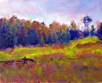
However, I tend to use at least one additional brush for convenience and to minimize cleaning. The big brush helps keep you away from detail - at least early in the painting process. It also facilitates a quick first stage in the painting - getting the canvas covered so you can begin to compare masses for value, hue, and intensity. I find that students tend to try to get to the end of a painting (details) before going through the beginning and middle. The big brush helps cure that problem. Then in time you find that you can "infer" detail with the big brush. The look is quite different. It focuses on shapes as opposed to things, and that helps develop the eye to "see". By this I mean you discover pieces of colour and then realize that colour for plane changes is what creates dimension and in turn detail.

This was painted in bright sun at Scottsdale farm in 45 minutes. Quite a different scene compared to spring time. The palette was Ultramarine Blue, Viridian, Cadmium Yellow, Cadmium Yellow Deep, Alizarin, and Titanium White.