Saturday, October 30, 2010

Level 8 Easel

I have never had a commercial easel in my studio.  I have made 4, and all but the first one are in use.  In the studio a French easel from plein air and 3 DIYs  are in constant use.  Since I started on a borrowed French easel, I have come to like my palette right in front of me between the canvas and me.  This keeps me further from the canvas helping with the discipline of avoiding a pencil grip and drawing practices such as "licking".  The location is great for mixing.  This easel was very inexpensive.  It has manual adjustments, up and down and angle of attack.  It is at a good height for standing while painting but can be lowered for a sitting approach.  It will take small canvases (6x8) and moderately large (48x72 or more).  Really large go on my garage easel.

Level 8 Easel

Here is the construction technique.  The table was rescued from a dark corner of my parents basement.  Many memories there.  Stripped it and glued it back together.  The drawer works.  A little musty.  Tubes don't seem to mind.  The rest is scrap wood.  1x2s and 1x3s form the H frame that is screwed on to a piece across the back of the table using small hinges.  The single leg at the back is also hinged.  Up the standing outer legs of the H are a set of 3/4" holes.  Dowel pins fit the holes and provide up and down adjustment.  A piece of scrap hardwood flooring goes across the dowels and the painting sits on a tongue of the hardwood.  I treated myself to a piece of baltic birch ply wood for the palette.  It sits on the table top.  It was treated with two rubbed coats of linseed oil.  It is cleaned after each painting session.  The can for medium is an empty Tuna tin.  Works great.

So how does the easel get its level 8 rating?  On the Ruby Rouge scale of 10 for the perfect easel, this easel does not have an automatic mechanism for raising and lowering (I drive a standard), it has no clamp on the upper edge to hold the top of the canvas (I don't have GPS) and it doesn't look pretty.  It just works.

Thursday, October 28, 2010

Pre Painting Thinking

We recently took at trip to the far north east reaches of Muskoka.  Feels more like Haliburton, but you turn the other way.  The group had the full gamut of experience.  So I chose a simple 4 shape image to do a demonstration.  It was early morning - well, not too early.  I had one of the participants tell me what colour wash to start with.  This gave them the comfort in knowing that there is no magic in that choice.  It was a manganese violet.  I decided that I would paint direct to keep the process simple.  I used the violet to mass in the shapes in their relative values.  The scene was right before me so it was easy to point out squinted features.  The next step was to add local and light affected colour to the masses.  All the edges were very soft at this point and no detail was even inferred.  I then showed how to break up the masses with other equal valued tones.  The unbalanced image received a few blobs to help rebalance.  Finally a sharp edge and some hi lites and accents.

Doe Lake Demo, 10x12, Oil on Board

Everyone nodded and raced off to create their own paintings.  Many had been used to painting one image for months and were quite enthused about the immediateness.  All had some difficulty painting what was there as opposed to what they expected to be there.  A few caught on to the idea of creating the scene and installing their design concept.  The ever changing plein air gave everyone a challenge.  Some tried a big brush and before the weekend was out , a few got the hang of it.

Tuesday, October 26, 2010

New Brushes, Nothing Like It

Yesterday it was time for a treat.  New brushes.  Four new bristle flats.  Although I did break out a $3 #12 a while ago in my plein air kit, these were four good Manets (French) that I am using in the studio.  Under controlled conditions I could really pay attention to them.  Beautiful!

#6 through #14, All Hogs

You have to understand that I have never thrown a brush out.  I even have a #1 with no bristles left on it.  You never know when you'll need that specially worn ragged brush.  Sometimes the older and more ragged the better.

The new brushes feel great.  Suddenly you have (or think you have) control.  They do precisely what you want.  Crisp edges, chunk patterns, corners, sides, ends, all distinct.

How long do they last?  It depends.  For me painting on canvas 50% of the time just about daily, it doesn't take long to break a new brush in and then relegate it to the "used" coffee can.  I keep a separate set in my plein air bag.  For a #6 that takes about 3 weeks, a #8, maybe 4 weeks, a #10 5 weeks, and a #14 2 months.  I use the large brush a great deal along with a similarly sized long filbert.  The smaller brushes fill in as required.  The #6 I use to draw when the painting is complex to deviate from massing in.  Lots of brushes.  I pick up a few each time I hit an art supply store carrying the makes I prefer.  It is great to have a set or two in reserve just to perk you up.

I like the flats and long filberts for a few reasons.  First, they hold a good load of paint.  The longer bristles are conducive to calligraphic strokes.  They wear down to brights and short filberts which are good for shovelling paint.  I like both Escoda and Manet filberts.

Sunday, October 24, 2010

Edges, Some Ways to Modify

Here we are back on edges, that important artist's tool often ignored in classes.  Every brushstroke has four edges.  It is rare that the stroke as laid down has all the right edges for your concept.

Two Brushstrokes with Edges, One Adjacent

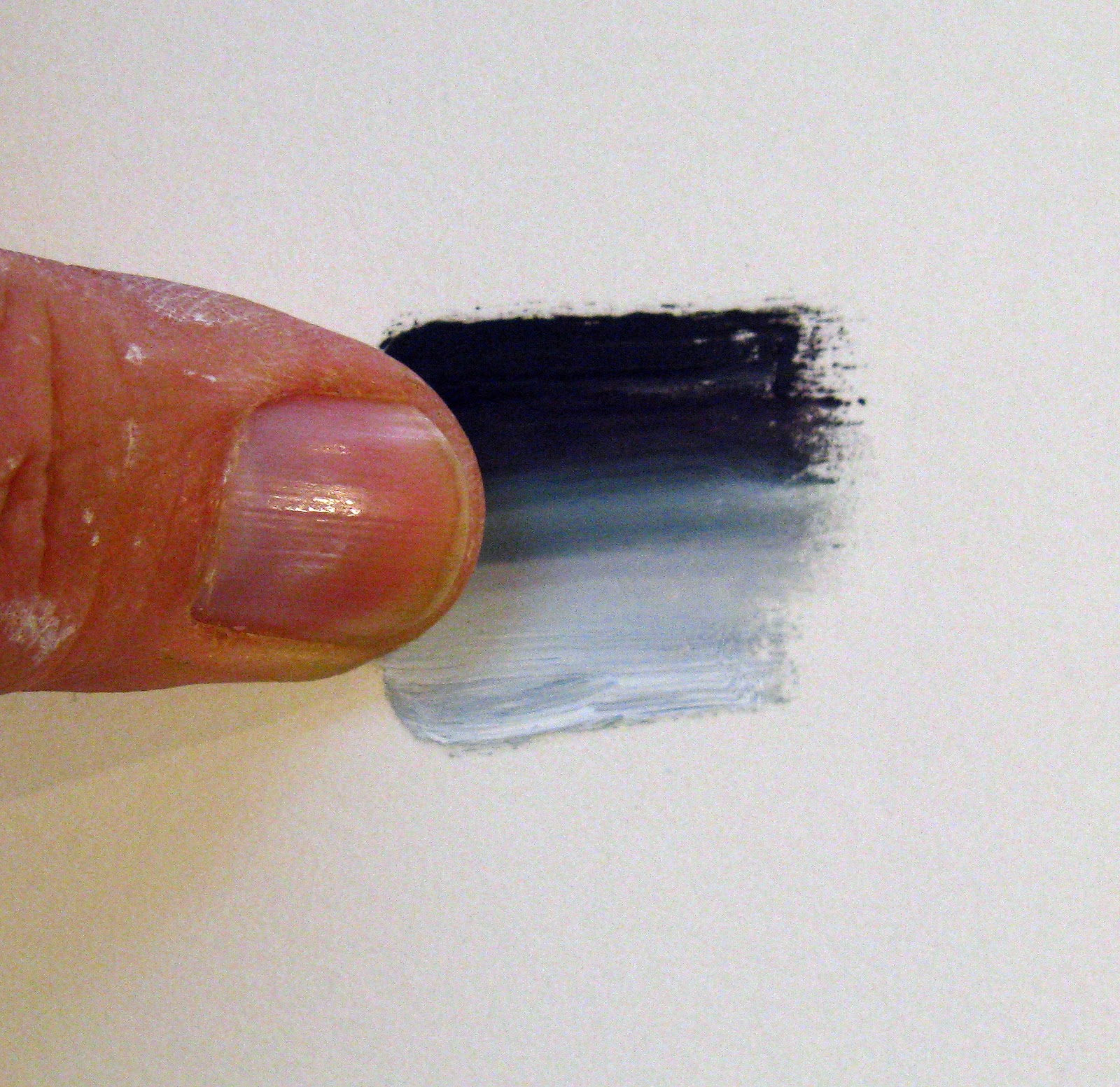
Here you can see a hard edge separating the two brushstrokes.  By chance the other edges are softer, but not extra soft.  What if your squinting determines that the two strokes should have a soft edge?  There are a number of ways to make that edge soft.

Lighten and Darken to Soften

Here the dark stroke has been lightened near the lighter stroke and the light stroke darkened near the dark stroke (small gradations).  The edge between the strokes seems softer even though it isn't.  So two adjacent strokes of close values will appear to have a soft edge between them.

An intermediate Brushstroke

Here a third stroke with an intermediate value is used to soften the edge between the two original brushstrokes.  This can be done with a dry brush.

An intermediate Value/Colour

Here a third stroke with the appropriate value but in a different hue is used for softening.

Brush with Medium

Here a brush with a bit of medium is used (wet brush).  Careful, one stroke.  A different effect.  A soft brush pulled between the two strokes looks like:

Dry Brush Softening

  You can change directions, wiggle the brush, move the paint etc.  If you want a different effect then;

Thumb, Palette Knife, Credit Card......

If not the universal painting tool, the thumb, then why not scrape with a palette knife or credit card?  Hardening an edge to catch attention can be done with a brush.

Bristle Brush Hard Edge

And for even more emphasis try the knife.

Knife Edge, Crisp and Hard

Friday, October 22, 2010

Lost Darks

I plan on returning to edges and edge making shortly.  First I thought you might enjoy seeing the following painting.  It was done outside in the rain on a grey day.  Enough for the book of excuses (You should hear my latest favourite from Randi).

So here is what I managed in the rain.  I had lost the darks (Harold always said to establish the darks - especially the greens - it takes a lot of paint to go verso).


Darks Lost, 10x12, Oil on Board

What to do?  This painting dried before I got to it.  Weddings and all.  So, I oiled-in the painting to give it the feel and look of the painting done on site - wet in wet.  I have talked about oiling-in before.  Then I proceeded to paint wet on wet reestablishing the darks from memory and my thumbnail sketch.  I did this before doing anything else.


Lost Darks Restored, 10x12, Oil on Board

The new darks are pretty much just blobs of paint.  They are of a tone in keeping with the depth of the image.  Warmer as they come forward.  This set up the skeleton on which to hang further painting as needed.


Darks Lost, 10x12, Oil on Board

Now remember, this was a grey day.  In the interior with little reference to the long distance the colours are robust since the intense light of the sun does not bleach them out.  On a day full of atmosphere one can paint from saturated colours by setting up for a close picture box - something like doing a still life.

Wednesday, October 20, 2010

From Squint to Image

The last post was long and convoluted.  Here is a crop of the final result.

On the Fence, Crop of 10x12, Oil on Board


You saw the squint.  You heard about the concept.  You heard about a few design ideas to enhance the concept.

Remember, you only saw photo reference.  I cannot overemphasize how incomplete that is.  I was on site and chose to install the values and hard edges that were important to me.

Friday, October 15, 2010

Edges 2

There are a number of purposes for controlled edges.

  • Expressing the edge of a shape turning towards or away from you.
  • Expressing relative smoothness of the edge of a shape
  • Pushing forms back or pulling them forward to establish their position relative to the other forms surrounding them.
  • Directing the viewers attention through our painting by subordinating a less important passage by using a soft series of edges, to an area you wish to be dominant, where you will use a harder edge.
  • Obtaining rhythm and variety throughout a painting by making your edges part of your design machinery.
If you begin your painting by massing in the major shapes and then proceed to the subject you may find it appropriate to start with softer edges.  Later you will feel more compelled to go back and modify some of these "approximate" edges.  Here you are sneaking up on the area of interest from the design of your concept as you progress.

If you paint "directly" (see Richard Schmid), you may start the painting in the subject area laying in intermediate and hard edges according to your design requirements.  Here you are subordinating areas not at the centre of interest as you progress.


Softening edges also gives a painting more unity. The eye "slides" more easily about the image without the hard edges seizing our attention to each separate area rather than allowing us to apprehend the entire image.

So, how do you come up with your design after the original concept has been determined?

Are you ready for this?  Squint and compare.  Squinting helps simplify the image, shows the relative value of the main masses (thus eliminating trivia), and it shows the relative softness and hardness of the edges associated.  You have to practice this.  You can practice in the kitchen while enjoying a cup of tea.

From before, a squint down noting edges.


Remember that this is a photo used for demonstration purposes.  The blurr occurs everywhere.  When you do this on site and you look at the subject area you choose, the hardest edge will occur there.  Out of the corner of your eye (while still looking at the subject area) the other areas will be subordinate.  This is how our eye works.  So when I was composing, my concept was to use a spot in the upper right hand third as the subject area.  The photo here shows some relatively hard edges there.  The noted hard edges shown above I subordinated.  The concept was to use the fence line to lead into the subject area.  I then used some colour and value contrast to further enhance the subject area.  

It takes more than seeing the edges, you have to design the effect and install them.  You are the artist.